
Enter your email below to be the first to hear about new releases, upcoming events, and more from Dig!

Please enter a valid email address
Please accept the terms
Best 80s Album Covers: 20 Iconic Artworks From An Outlandish Era
List & Guides

Best 80s Album Covers: 20 Iconic Artworks From An Outlandish Era

The best 80s album covers stand as evocative artworks that prove the decade transcends its reputation for disposability.

Back

The 80s have always polarised opinion. Synonymous with Margaret Thatcher, Reaganomics yuppies and Live Aid, the era’s aspirational values extended to the music it produced, with the glossy production techniques of the day holding sway as the CD format was introduced and subsequently threatened to usurp vinyl. Despite all that, the record sleeve remained a highly respected medium for art – as the best 80s album covers prove.

Listen to the best of the 80s, here, and check out our best 80s album covers, below.

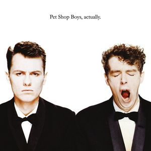
20: Pet Shop Boys: ‘Actually’ (1987)

Though it’s arguably now the most iconic of all the best Pet Shop Boys album covers, the sleeve for their second album, Actually, was conceived with one eye on the clock. A couple of ideas for the record’s cover (including a specially commissioned painting of Chris Lowe and Neil Tennant, by artist Alison Watt) had already fallen through, and the record’s September 1987 release date was imminent when Lowe and Tennant discovered an image captured during the video shoot for their Dusty Springfield collaboration, What Have I Done To Deserve This?  

Taken by photographer Cindy Palmano, the low-key image pictured Tennant yawning, and while its use was somewhat tongue-in-cheek, the shot has since become not only one of the best 80s album covers, but also arguably Pet Shop Boys’ defining image. “It was one of those things that maybe people wonder whether we were serious or not,” Tennant later noted. “In fact that album itself is pretty serious. Even the jokes are serious jokes.” 

Photographer: Cindy Palmano | Designers: Mark Farrow, Pet Shop Boys 

19: Talking Heads: ‘Remain In Light’ (1980)

The dense, polyrhythmic funk Talking Heads and producer Brian Eno created for the band’s fourth album was highly original, but the innovation didn’t end there: Remain In Light also came housed in one of the first computer-generated record sleeves, providing an example of how the best 80s album covers could – like the best 80s albums – harness emerging technologies to create something of its time, yet also timeless.

Conceived by rhythm section Chris Frantz and Tina Weymouth, with help from Massachusetts Institute Of Technology researcher Walter Bender, Remain In Light’s front cover featured individual portraits of the four band members blotted out with blocks of red colour, while the back cover depicted a similarly CGI-enhanced collage of red warplanes flying in formation over the Himalayas. Weymouth attended MIT regularly during the summer of 1980, and worked on the sleeve with Bender’s colleague Scott Fisher, but the process proved slow as computer technology was still limited. Indeed, in those days, the MIT’s mainframe computer was so big it took up several rooms.

Computer images: Scott Fisher, Tina Weymouth and Chris Frantz | Graphic designers: Tibor Kalman/M & Co New York

Remain in Light 80s album cover

18: The Pogues: ‘Rum Sodomy & The Lash’ (1985)

Something of a maritime theme ran through the promotion and packaging of The Pogues’ landmark second album, Rum Sodomy & The Lash. The record’s controversial title referred to some of the Royal Navy’s allegedly darker practices, and Stiff Records dressed the band up in 18th- and 19th-century naval uniforms for the album’s rear-sleeve photo shoot. From there, it wasn’t such a stretch to continue the theme to the front cover, for which Stiff’s art department ingeniously tweaked Théodore Géricault’s Romantic-era shipwreck painting Le Radeau De La Meduse (“The Wreck Of The Medusa”) by superimposing the heads of the band members over the painting’s original figures.

In his memoir, Here Comes Everybody: The Story Of The Pogues, multi-instrumentalist James Fearnley recalled: “My head replaced that of the painter Eugène Delacroix, who had apparently been the model for the figure in the foreground, my arm draped over Spider [Stacy, singer]’s lifeless body. Jem [Finer, banjo]’s head replaced that of the man alerting the occupants of the raft to the distant rescue ship.”

Original painting: Théodore Géricault | Additional artwork: Peter Mennim | Design concept: Frank Murray

17: Bruce Springsteen: ‘Born In The USA’ (1984)

One of the era’s defining albums, Bruce Springsteen’s Born In The USA won a Grammy award, sold in the multi-millions and is still widely regarded as The Boss’ quintessential record. However, in the same way that its title track is often misrepresented, Born In The USA’s sleeve is often misunderstood. Shot from behind, Annie Leibowitz’s iconic portrait led to rumours that Springsteen was urinating on the US flag. In 1994, however, Springsteen emphatically set the record straight, telling Rolling Stone, “No, no, we took a lot of different types of pictures, and in the end, the picture of my ass looked better than the picture of my face, so that’s what went on the cover, that’s all. I didn’t have any secret message.”

Photographer: Annie Leibovitz | Designer: Andrea Klein

Best album covers Bruce Springsteen Born In The USA

16: ZZ Top: ‘Eliminator’ (1983)

If ever a record was based around cars and girls, then it was surely ZZ Top’s massive eighth album, Eliminator. It took its name from a drag-racing term for any category of cars competing against each other, after manager Bill Ham suggested the band should feature frontman Billy Gibbons’ newly customised 1933 Ford Coupe on the sleeve.

Gibbons’ car became central to the whole concept surrounding the record, as it also appeared prominently in the memorable, MTV-friendly videos Tim Newman directed for the album’s hit singles, Gimme All Your Lovin’, Sharp Dressed Man and Legs, all of which featured models driving the car. As Texas Monthly suggested, the ZZ Top videos depicted North America as “a land of rock and roll, cars and girls”. Pictured proudly on Eliminator’s cover, Gibbons’ Coupe is rendered with its headlights on full beam, in a painting by artist Tom Hunnicutt which still stands as one of the best 80s album covers.

Illustrator: Tom Hunnicutt | Artwork coordinator: Bob Alford

ZZ Top Eliminator

15: Van Halen: ‘1984’ (1984)

Des Moines, Iowa-based husband-and-wife team Jay Vigon and Margo Nahas have been involved in hundreds of album design projects, but they hit the motherlode in 1984 when Vigon designed the famous logo used for Prince’s landmark Purple Rain album and film, and Nahas painted the cover art for Van Halen’s 1984 – a blockbuster record only kept off the top of the Billboard 200 by Michael Jackson’s Thriller.

Warner Music team Richard Seireeni and Pete Angelus pitched Nahas’ work to Van Halen, who had originally decided on using a Nahas image of four chrome women dancing, though that didn’t work out. However, the band were bowled over by another of Nahas’ paintings – a striking, slightly subversive image of a putto (a cherub-like male child) stealing cigarettes – and they decided it would be perfect for 1984. Now remembered as one of the best Van Halen album covers, the original image had actually featured Carter Helm, the child of one of Nahas’ best friends, holding a candy cigarette, but the sleeve still created controversy in the UK, where the album was issued with a sticker that obscured both the cigarette in the putto’s hand and the open pack on the table in front of him.

Illustrator: Margo Nahas | Art direction: Pete Angelus, Richard Seireeni

Van Halen 1984

14: Kraftwerk: ‘Computer World’ (1981)

Kraftwerk’s widely lauded eighth album, 1981’s Computer World, featured a collection of songs with themes such as home computers and digital communication, and – in retrospect – it can be viewed as both a celebration of computer technology as well as a warning about its potential to exert power on society through social control and digital surveillance.

Bearing in mind Computer World was released barely 12 months before Commodore widely issued the first true home computer (the Commodore 64), it seems wholly apt that the album’s sleeve should portray a then state-of-the-art computer terminal. Set against a brilliant yellow background, the stark yet striking image was designed by the German quartet’s long-term art director, Emil Schult, and while it remains one of the best 80s album covers, it still feels highly prescient today.

Designer: Emil Schult | Photographer: Günter Fröhling

Kraftwerk Computer Love

13: David Bowie ‘Scary Monsters (And Super Creeps)’ (1980)

Having created the best album cover of the 70s, its no surprise that David Bowie would be behind some of the best 80s album covers, too. Scary Monsters (And Super Creeps)’s highly inventive sleeve features a large-scale collage by artist Edward Bell, featuring Bowie in the Pierrot costume worn in the Ashes To Ashes music video, along with images taken by photographer Brian Duffy. The original album’s rear sleeve, meanwhile, referred to four earlier Bowie album covers, namely 1973’s Aladdin Sane (which was also designed and photographed by Duffy) and those from the “Berlin Trilogy”. The sleeves from Low, “Heroes” and Lodger – the latter depicting Bowie’s torso superimposed on the figure from Aladdin Sane’s inside gatefold picture – were portrayed in small, whitewashed frames to the left of the Scary Monsters tracklist.

Photographer: Brian Duffy | Designer: Edward Bell

david-bowie-scary-monsters-dig

12: The Stone Roses: ‘The Stone Roses’ (1989)

The Stone Roses’ self-titled debut album defined the Madchester explosion on the cusp of the 90s, when indie-pop invaded the dancefloor with spectacular results. Assembled by guitarist John Squire, The Stone Roses’ enigmatic artwork enhanced the album’s legacy, with Squire’s Jackson Pollock-esque paint splatters forming the backdrop for the album’s title. Sharing its name with one of the album’s standout songs, Squire’s painting, titled Bye Bye Badman, also featured daubs of red, white and blue, plus three slices of lemon, but while these individual components initially seemed random, they formed a cohesive whole.

“The lemons aren’t part of the picture, they’re real lemons nailed on because it was photographed on the wall,” Squire later explained to biographer Simon Spence. “It ties in with the lyrics to Bye Bye Badman, to do with the Paris student uprisings of May 1968. Me and Ian [Brown, singer] saw a documentary on it, and the students used to suck lemons to nullify the effects of tear gas. That’s why the [French] tricolour is in there too.”

Photographer: Ian T Tilton | Designer: John Squire

Stone Roses 80s album cover

11: Echo And The Bunnymen: ‘Heaven Up Here’ (1981)

Having photographed Echo And The Bunnymen in a dark, dreamlike state in a woods in Hertfordshire for the cover of their debut album, Crocodiles, Brian Griffin decided to shoot the band on a wet beach in the South Wales seaside town of Porthcawl for the cover of their landmark second album, Heaven Up Here.

Both brooding and atmospheric, the resulting image is now regarded as one the best 80s album covers – but it proved extremely difficult to capture. Griffin had to improvise in a way that recalled the lengths Alfred Hitchcock went to in order to capture frenzied flocks of birds while shooting his classic 1963 horror film The Birds.

“We had buckets of fish offal and had a guy run up the beach throwing guts in the air to attract the gulls,” Griffin told The Week in a 2017 interview. “After the shoot we all piled into this seven-seater black Peugeot estate I had on hire, and drove away from the beach. There was me, my assistant, The Bunnymen and the fish guts man who was stinking the car out.”

After all that, Griffin discovered that the band’s label, Korova, and manager, Bill Drummond, weren’t satisfied with the results. “They didn’t like the four little silhouettes at all,” he said. “I had to fight along with Martyn Atkins, the designer, for that. It was a hard sell.” However, Griffin was vindicated in the end: Heaven Up Here received NME’s Best Dressed LP award in 1981, and its reputation as one of post-punk’s most iconic images has grown in stature ever since.

Photographer: Brian Griffin | Designer: Martyn Atkins

Echo and the bunnymen heaven up here

10. Duran Duran: ‘Rio’ (1982)

Cheshire-born graphic designer Malcolm Garrett made a name for himself during the punk era thanks to his classic sleeves for Buzzcocks and Magazine. However, his profile rose far higher during the 80s, when he became Duran Duran’s de facto art director and go-to designer during their commercial heyday, from 1981 to 1986.

During this intensive period, Garrett created a number of memorable album covers for the band, but arguably none are more iconic than his cover image for Duran Duran’s mega-selling second album, Rio. Remarkably, Garrett – who had little more than a week to execute the concept – hadn’t even heard the album’s famous title track when he began the commission, but, as he later told Classic Rock, the name of the album “made me think of cigars and cigar packaging. The whole idea of something Latin and something Cuban and South American.”

Garrett’s design, executed by painter Patrick Nagel, duly evoked a 50s cigar box, but his retro-futurist approach worked a treat, with the band in particular going on to enthuse about the Rio sleeve for years to come. Duran Duran Keyboardist Nick Rhodes even stated that Garrett’s glamorous Rio image “just seemed to represent everything we wanted at that point”.

Designer: Malcolm Garrett | Photographer: Andy Earl | Illustrator: Patrick Nagel

Rio

9: Talk Talk: ‘The Colour Of Spring’ (1986)

Having begun life as a highly promising, chart-oriented synth-pop act during the early-to-mid 80s, with the albums The Party’s Over and It’s My Life, Talk Talk then made one of modern music’s most unexpected left turns. Under the tutelage of prime mover Mark Hollis, the group pursued an increasingly singular path away from mainstream pop towards an introspective, genre-eschewing style all their own across three remarkable albums, The Colour Of Spring (1986), Spirit Of Eden (1988) and Laughing Stock (1991).

Wonderfully, Talk Talk’s holy trinity came housed in sleeves of similarly otherworldly beauty designed by graphic artist James Marsh, and all his nature-based images remain mini masterpieces. Marsh’s shell tree, adorning Spirit Of Eden, could just as easily have made this list of the best 80s album covers, but the flotilla of butterflies and moths depicted on the cover of the band’s commercial peak, The Colour Of Spring, retains an especially ageless quality all its own.

Illustrator: James Marsh

Talk Talk The Colour Of Spring

8: Joy Division: ‘Closer’ (1980)

Designer Peter Saville’s evocative sleeve for Joy Division’s second album, Closer, ranks highly among the best 80s album covers, but at the time it proved highly contentious. One of a series of images shot by photographer Bernard Pierre Wolff in 1978, it depicts an ornate family vault in an Italian graveyard, but because Closer was released just weeks after Joy Division vocalist Ian Curtis committed suicide, both the band and Factory Records were accused of sensationalism – even though everyone had agreed on the sleeve design while Curtis was still alive.

“The cover for Closer was like a work of antiquity, but inside is a vinyl album, so it’s a postmodern juxtaposition of a contemporary work housed in the antique,” Saville told The Guardian in 2011. “At first, I didn’t believe the photo was an actual tomb, but it really exists in a cemetery in Genoa. When [Factory co-founder] Tony Wilson told me Ian Curtis had died, I said, “Tony, we have a tomb on the cover.” There was great deliberation as to whether to continue with it. But the band, Ian included, had chosen the photograph. We did it in good faith and not in any post-tragedy way.”

Photographer: Bernard Pierre Wolff | Designer: Peter Saville

Closer 80s album

7: Pink Floyd: ‘A Momentary Lapse Of Reason’ (1987)

Painstakingly assembled in real time without the benefit of CGI or Photoshop, the concept behind Hipgnosis’ sleeve for Pink Floyd’s first post-Roger Waters album, A Momentary Lapse Of Reason, derived from a lyric from one of the record’s key tracks, Yet Another Movie: “The sun that burned a fiery red/The vision of an empty bed.”

Frontman David Gilmour further fleshed out the original idea by suggesting the image should have a Mediterranean flavour and represent “vestiges of relationships that have evaporated, leaving only echoes”. Hipgnosis designer Storm Thorgerson and his team made this a reality by assembling hundreds of hospital beds (by hand) on Saunton Sands, in North Devon. The whole project took around a fortnight to complete, though lensman Bob Dowling was rewarded for his efforts with a gold award at the subsequent Association Of Photographers Awards, and the sleeve remains of the best Pink Floyd album covers of the post-Waters era.

Designer: Storm Thorgerson/Hipgnosis | Photographer: Bob Dowling.

Pink Floyd A Momentary Lapse of Reason

6: Kate Bush: ‘Hounds Of Love’ (1985)

The beautiful, soft-focus image of Kate Bush lying on a backdrop of lilac net and silk which adorns arguably her best album, Hounds Of Love, featured the singer-songwriter posing with her friend’s two dogs, Weimaraners known as Bonnie and Clyde. Bush’s brother, John Carder Bush, was behind the camera for the shoot, and he needed to exercise considerable skill and patience to capture the image, which is now recognised as one of the best 80s album covers of all time.

“An hour after the dogs arrived, we managed to persuade them to lie down next to Kate,” he explained at the time. “Not surprising that they took so long, as they are not trained dogs, and couldn’t understand what all the fuss was about. I had a minute to hoover up as much as I could before they were off again, tending to use Kate as a launching ramp for their leaps and cavorting.”

Photographer: John Carder Bush | Designer: Bill Smith Studio

Hounds of Love 80s album cover

5: Prince: ‘Sign O’ The Times’ (1987)

Sign O’ The Times sleeve designer Laura LiPuma later recalled that Prince effectively borrowed the backdrop for the album’s memorable cover from a Minneapolis stage production of the musical Guys And Dolls, and then had his team add props taken from his studio and home. Regardless of the original inspiration, it’s an incredible assemblage, which photographer Jeff Katz (who also shot the photo for Prince’s Parade album cover) vividly recalled Prince putting together: the musician was “so careful in his thought process”, the photographer told Pitchfork, “but he was also willing to go to this loose, surreal, conceptual place”.

Photographer: Jeff Katz | Art direction: Laura LiPuma

Sign O' The Times Prince Album Cover

4: Iron Maiden: ‘Powerslave’ (1984)

Another timeless image created prior to the advent of Photoshop and the 21st-century’s ever-evolving technological aids, Derek Riggs’ spectacular image for the cover of Iron Maiden’s fifth album, Powerslave, came from an idea floated by Maiden’s leader, Steve Harris, who wanted a sleeve featuring band mascot Eddie “as part of a pyramid” to go with the album’s Egyptian theme. With A3 layout paper, determination and a whole lot of skill, Riggs created the mighty, Sphinx-like image of Eddie that duly adorns one of the best Iron Maiden album covers of all time.

Playing down his painstaking creation in an interview with Canada’s The Auburn Reporter, Riggs explained the advantage of using layout paper: “It’s like tracing paper, but it’s cheaper and it’s thinner so that you can draw a picture, and then you can drop the next page over the top of it, and trace the good bits and improve it.” Over time, one of the best 80s album covers emerged. “When I finished it it was about five foot square and it was all taped together,” Riggs revealed.

Designer: Derek Riggs | Illustrator: Derek Riggs

3: The Smiths: ‘Meat Is Murder’ (1985)

The Smiths’ third album, The Queen Is Dead, is widely regarded as the Mancunian quartet’s masterpiece, but when it comes to their album covers, their second record, Meat Is Murder, takes some beating. Frontman Morrissey was personally involved in choosing all The Smiths’ artworks, but while some of them could be coy and/or suggestive (not least the sleeves for early singles such as Hand In Glove and This Charming Man), the image he chose for Meat Is Murder’s front cover was unusually direct, depicting US Marine Corporal Michael Wynn, from director Emile De Antonio’s controversial Vietnam War documentary, In The Year Of The Pig. To ram his anti-war/pro-vegetarian messages home, Morrissey replaced the slogan “Make Love Not War”, as scrawled on Wynn’s helmet in the original image, with The Smiths’ album title, creating one of the best 80s album covers in the process.

Cover star: US Marine Corporal Michael Wynn (still from Emile De Antonio’s In The Year Of The Pig) | Sleeve design: Morrissey | Layout: Caryn Gough

Meat Is Murder

2: Madonna: ‘Like A Prayer’ (1989)

Most of Madonna album covers are befitting of a star with such iconic status, and you could argue that either the Like A Virgin sleeve or Herb Ritts’ Marilyn Monroe-esque True Blue portrait could have made the cut among the best 80s albums covers. Ultimately, though, 1989’s Like A Prayer marked Ms Ciccone’s first major stylistic reinvention, and the record came housed in a fittingly striking artwork. Again photographed by Ritts (who also directed the video for one of the album’s best-loved singles, Cherish), the Like A Prayer sleeve put a suggestively feminist spin on The Rolling Stones’ Andy Warhol-designed Sticky Fingers artwork. As The Guardian later put it, “It’s hard to think of an album more evocative of women in the 80s than Like A Prayer, with its juxtaposition of jewels, religious iconography and high-waisted pale denim jeans.”

Photographer: Herb Ritts | Designer (logo): Margo Chase

Like A Prayer Madonna

1: New Order: ‘Power, Corruption & Lies’ (1983)

As the decade responsible for some of rock and pop’s most enduring artworks, something exceptional needs to top our list of the best 80s album covers – and New Order’s Power, Corruption & Lies certainly fits the bill. Feeling the record’s title had Machiavellian overtones, designer Peter Saville visited London’s National Gallery looking for a portrait of “a dark prince”, but instead ended up homing in on Henri Fantin-Latour’s gloriously delicate late 19th-century oil painting A Basket Of Roses, which the designer’s girlfriend believed would make a better fit.

“It was a wonderful idea, for flowers suggested the means by which power, corruption and lies infiltrate our lives – they’re seductive,” Saville enthused in a 2011 interview with The Guardian. “Tony Wilson had to phone the gallery director for permission to use the image. In the course of the conversation, he said, ‘Sir, whose painting is it?’ To which the answer was, ‘It belongs to the people of Britain.’ Tony’s response was, ‘I believe the people want it.’ And the director said, ‘If you put it like that, Mr Wilson, I’m sure we can make an exception in this case!”

Designer: Peter Saville (adapted from Henri Fantin-Latour’s A Basket Of Roses (1890), from The National Gallery, London)

Looking for more? Check out the best 80s music videos.

Original article: 22 July 2021

Updated: 23 July 2023

More Like This

‘The Division Bell’: A Track-By-Track Guide To Pink Floyd’s Bold 90s Comeback
List & Guides

‘The Division Bell’: A Track-By-Track Guide To Pink Floyd’s Bold 90s Comeback

Reasserting Pink Floyd’s prog-rock mastery in the 90s, the group’s 14th studio album, ‘The Division Bell’, rang in a triumphant comeback.

Best Tracy Chapman Songs: 20 Audacious Explorations Of Love And Life
List & Guides

Best Tracy Chapman Songs: 20 Audacious Explorations Of Love And Life

Looking for answers to all the big questions, the best Tracy Chapman songs form the basis of a formidable musical legacy.

Sign up to our newsletter

Be the first to hear about new releases, upcoming events, and more from Dig!

Sign Up