
Enter your email below to be the first to hear about new releases, upcoming events, and more from Dig!

Please enter a valid email address
Please accept the terms
Van Halen Album Covers: All 12 Studio Artworks, Ranked And Reviewed
Alamy Stock Photo
List & Guides

Van Halen Album Covers: All 12 Studio Artworks, Ranked And Reviewed

Whether using their iconic winged logo or imaginative illustrations, the best Van Halen album covers define classic rock music.

Back

One of the most explosive bands in rock’n’roll, Van Halen defined the sound and style of hard rock as the 70s rolled into the 80s. Across a career that spans almost five decades, all 12 Van Halen album covers are as much a reflection of the group’s legacy as they are a window into its mythology. From stunning works of graphic design to censors-baiting obscenities, we rank and review each one.

Listen to the best of Van Halen here, and check out our best Van Halen album covers, below.

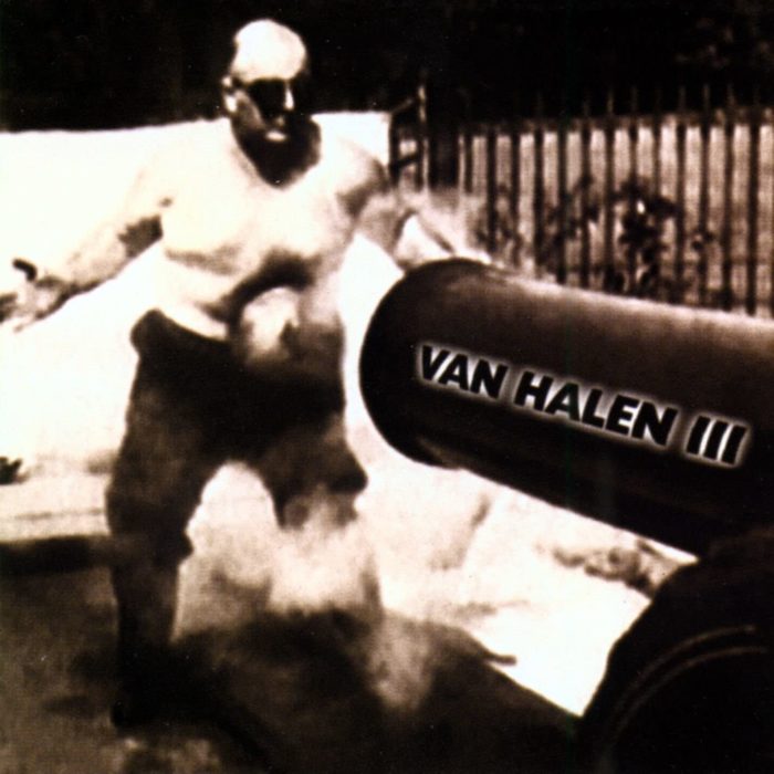
12: ‘Van Halen III’ (1998)

Eleven albums in, and with grunge music having completely changed the rock landscape, Van Halen chose an action shot of Frank “Cannonball” Richards for their Van Halen III album cover. Richards made a vaudeville career out of taking blows to the stomach – first from ordinary people, before graduating to sledgehammer hits and, as his nickname suggests, iron balls launched from a canon. Twenty years on from the release of Van Halen’s self-titled debut album, was this a comment on the resilience needed to maintain a long-standing career in rock music?

Art director: Stine Schyberg

Van Halen III


11: ‘Diver Down’ (1982)

“There was something going on that’s not apparent to your eyes,” David Lee Roth said of the artwork for 1982’s Diver Down album. “You put up the red flag with the white slash. Well, a lot of people approach Van Halen as sort of the abyss. It means, it’s not immediately apparent to your eyes what is going on underneath the surface.” As the band’s longtime manager Noel Monk later revealed, there was, indeed, more going on than met the eye, with Diver Down’s split between original songs and covers (including a hit take on Roy Orbison’s Oh, Pretty Woman) causing internal tension over the band’s direction, even as the album his No.3 in the US – their highest chart placing at that time.

Art director: Pete Angelus

Diver Down Van Halen

10: ‘For Unlawful Carnal Knowledge’ (1991)

The story behind For Unlawful Carnal Knowledge’s album title is steeped in the censorship battle of the 80s and early 90s, which took pop and rock music to court and resulted in the introduction of “Parental Advisory: Explicit Content” stickers on the front of record sleeves. Frontman Sammy Hagar had originally wanted to call the album “FUCK”, but settled on For Unlawful Carnal Knowledge, an acronym that lightweight boxing champ Ray Mancini had made him aware of. Unsurprisingly, the innuendo-laden lyrics of songs such as Spanked and Poundcake didn’t stray far from the title. One of a pair of Van Halen album covers photographed by Glen Wexler, For Unlawful Carnal Knowledge’s artwork features Dave Bhang’s ringed Van Halen logo front and centre against maroon upholstery resembling a guitar amp. Below it, that controversial album title.

Photographer: Glen Wexler | Art director: Jeri Heiden

For Unlawful Carnal Knowledge

9: ‘OU812’ (1988)

Van Halen’s second album with Sammy Hagar, OU812 features a stripped-down monochromatic portrait inspired by the artwork for The Beatles’ second album, Meet The Beatles. It’s also the only Van Halen album cover to feature Hagar on the front. As album titles go, this one isn’t without its subliminal messaging. When read aloud, it sounds like “Oh, you ate one, too”, rumoured to be a response to David Lee Roth’s solo debut album, Eat ’Em And Smile, which the singer released after he left the band.

Photographer: Eika Aoshima | Art director: Jeri Heiden

OU812

8: ‘A Different Kind Of Truth’ (2012)

Roth was back in the fold for Van Halen’s final studio album, which also reintroduced their iconic winged logo on the sleeve. The singer presented the concept – of a New York Central Railroad J-3A Dreyfuss steam locomotive roaring into view – to graphic designers SMOG Design, and the Los Angeles-based company did the rest. “This cover becomes an instant classic because it’s Van Halen’s long-awaited reunion with David Lee Roth after a 20-year hiatus,” SMOG co-owner John Heiden said. The results also bore a striking similarity to the artwork for Commodores’ 1975 album Movin’ On.

Photographer: Robert Yarnall Richie | Designers: Smog Design

7: ‘Balance’ (1995)

The most mature, visually complex of Van Halen album covers, Balance was photographed by Greg Wexler, who later told Resource that the inspiration came from discussions with drummer Alex Van Halen about the “turmoil and changes surrounding” the group. “A lot was going on for them, including coming to terms with the recent death of their long-time manager, Ed Leffler,” Wexler recalled. Alex wanted to explore the duality of the human psyche, and Wexler reflected this with a series of photos of a young boy, edited together to create an image of androgynous conjoined twins. Set against an apocalyptic landscape, the twins’ pose resembles the shape of the lettered Van Halen logo, while, as Wexler revealed, the see-saw nodded to the two children’s inability to play together.

Photographer: Glen Wexler | Art director: Jeri Heiden

Balance Van Halen Cover


6: ‘5150’ (1986)

Van Halen’s fifth album was the first to feature Sammy Hagar, and its artwork reflects the gravity of the line-up change. 5150 features bodybuilder Rick Valente on the cover in an archetypical Atlas pose, carrying a massive chrome sphere ringed by the “VH” logo. The rear sleeve pictures Valente crushed under the weight of the sphere, which has broken open to reveal the new line-up within. Named after Eddie Van Halen’s home studio, 5150 landed with as much impact as the album cover suggested, going platinum within the US in its first week.

Art directors: Van Halen, Jeri McManus

5150 Van Halen Album Cover


5: ‘Women And Children First’ (1980)

Unique among Van Halen album covers, Women And Children First’s artwork finds the band’s original line-up posing together in the same photo. Shot by rock photographer Norman Seeff, the portrait sees the group in a tight huddle around Eddie Van Halen, who brandishes his latest creation, the custom Ibanez Destroyer he nicknamed “The Shark”. Braced by his bandmates, Eddie arcs backward, bending the note on the guitar’s tenth fret in ecstasy – a fitting image for the album, which was the group’s first to feature all original songs. It also reinforces the star of the show: Eddie Van Halen and his dazzling guitar playing.

Photographer: Norman Seeff | Art director: Richard Seireeni

Women And Children First


4: ‘Fair Warning’ (1981)

The Fair Warning artwork marked a significant departure for Van Halen album covers. Featuring selections from William Kurelek’s painting The Maze – a deeply personal work that documents the artist’s traumatic childhood via a series of vignettes – the four panels on the front sleeve convey frustration, anger and aggression, complimenting the dark and gritty tone of the album itself. Whether or not the design offers a window into the band’s state of mind throughout its recording sessions is something fans have been trying to decide upon ever since.

Illustrator: William Kurelek

Fair Warning’

3: ‘Van Halen II’ (1979)

Capitalising on the success of their debut album, Van Halen kept the artwork for its follow-up simple: Dave Bhang’s winged logo undergoes a slight 3D makeover and is placed across a midnight-blue canvas. Add the album’s title in expansive typography and you have one of the coolest album covers in rock’n’roll. The design’s simplicity is fitting given that the band recorded Van Halen II in less than a week, capturing the majority of its tracks in one take and building on the foundation of the musicianship and iconography of its predecessor.

Designer: Dave Bhang | Art director: Dave Bhang

Van Halen II

2: ‘1984’ (1984)

With smoking-hot tracks such as Hot For Teacher and Panama, it’s only fitting that 1984 boasts an album cover as eye-catching at this. Graphic designer Margo Nahas had made a name for herself creating chrome figures, and the band initially commissioned her to produce four dancing chrome women for the artwork, but complications forced Nahas to abandon the design. “All I could think of was the technical issues of having the multiple reflections of four dancing women, since they wouldn’t have been independent. [The band] wanted them all dancing together,” she recalled. When the band saw Nahas’ wider portfolio, they singled out this photorealistic image of a cherubic child holding a cigarette. With just a touch of rebellion, the album cover encapsulated the innocence and playfulness at the heart of Van Halen at the time, though it caused controversy in the UK and Europe, with some outlets censoring the cigarette with a sticker.

Illustrator: Margo Nahas | Art director: Pete Angelus

1984 van halen album cover


1: ‘Van Halen’ (1978)

Van Halen insisted on forming their own identity right out of the gate, and pushed back against the original design for their debut album, arguing that it tried to define them as a punk act. As Eddie later told Guitar World, “They tried to make us look like The Clash. We said, ‘Fuck this shit!’” Looking for an alternative, Warner Bros enlisted Elliot Gilbert to photograph the band onstage at LA’s Whiskey A Go Go, resulting in one of the most iconic album covers in rock history. Across four panels, each band member is immortalised in action; Eddie, pictured in the top-left corner, casually shows off his custom Frankenstrat – the guitar he built to create his trademark “brown sound”, forever changing rock’n’roll in the process. Connecting the four musicians is, appropriately, the band’s equally iconic logo. Topping our run-down of all 12 Van Halen album covers, this is the one that started it all.

Photographer: Elliot Gilbert | Art director: Dave Bhang

Van Halen album covers

Find out how Van Halen’s debut album changed the game forever.

More Like This

10 Iconic Moments From Madonna’s Landmark Celebration Tour
List & Guides

10 Iconic Moments From Madonna’s Landmark Celebration Tour

Dazzling visuals, staggering statistics, mind-bending merch: these are the most memorable moments from Madonna’s greatest-ever tour.

‘Parklife’: A Track-By-Track Guide To Every Song On Blur’s Breakthrough Album
List & Guides

‘Parklife’: A Track-By-Track Guide To Every Song On Blur’s Breakthrough Album

‘Parklife’ made Blur a household name in the 90s. This track-by-track guide to the album breaks down each of its 16 songs.

Sign up to our newsletter

Be the first to hear about new releases, upcoming events, and more from Dig!

Sign Up