Iron Maiden’s zombie-like mascot, Eddie, is as synonymous with the band as their titanic music. The group’s original illustrator, Derek Riggs, deserves most of the credit for this, as his iconic artworks depicting Eddie’s exploits are now as instantly recognisable as anything by graphic-design giants such as Hipgnosis’ Storm Thorgerson, Factory Records’ Peter Saville or Yes’ Roger Dean. More recently, though, Riggs has passed the baton to other talented artists, such as Melvyn Grant, Tim Bradstreet and Mark Wilkinson, to reinvent Eddie for the 21st century. The best Iron Maiden album covers, then, not only show record sleeves at their most creative, but capture the heavy metal pioneers as their imagery evolves down through the ages.

Best Iron Maiden Album Covers: 20 Of Eddie’s Finest Moments
Gory but glorious, the best Iron Maiden Album covers, starring the band’s undead mascot, Eddie, are among heavy metal’s most iconic images.

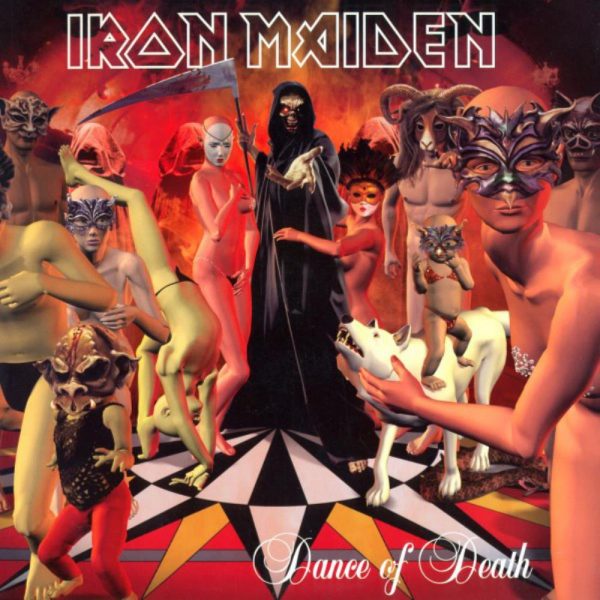
20: ‘Dance Of Death’ (2003)
2003’s Dance Of Death artwork was originally designed by David Patchett, renowned for his work with doom-metal band Cathedral. The story goes that the artist’s original illustration, which featured just Iron Maiden’s legendary mascot, Eddie (depicted as Death), with the monks in the background, was deemed too sparse for use, so another team were asked to use computer-generated imagery to create the other characters, adding both colour and texture. Though a step away from the group’s long-established hand-drawn approach, the Dance Of Death artwork remains a striking entry among Iron Maiden album covers.
Illustrator: David Patchett

19: ‘Virtual XI’ (1998)
Artist Melvyn Grant’s first Iron Maiden commission was his memorable sleeve for 1992’s Fear Of The Dark album, and he returned to illustrate 1995’s The X Factor and 1998’s Virtual XI. Grant’s brief for the latter was to design something related to virtual reality, though he was later asked to add a football game into the artwork, as the group wanted to link the album’s release with the 1998 World Cup. Grant’s sci-fi-influenced image of Eddie, portrayed as a Death figure reaching out to the viewer while a burning sky seems to burst from his head, offers a very Maiden-like take on Y2K fever.
Illustrator: Melvyn Grant

18: ‘The X Factor’ (1995)
Iron Maiden’s tenth studio album, The X Factor, saw the group striking out into uncharted territory. New vocalist Blaze Bayley (ex-Wolfsbane) had replaced Bruce Dickinson, and the band’s long-term producer Martin Birch had also retired following 1992’s Fear Of The Dark. Artist Melvyn Grant viewed these changes as an opportunity to put a new twist on the band’s visuals; his visceral artwork, depicting Eddie being brutally savaged by a machine, reflected the darker tone of the music contained within. “I did try and change him a bit… in a way that suited me,” Grant said in an interview with metal fan-site Brave Words.
Illustrator: Melvyn Grant

17: ‘A Real Live One’ (1993)
Iron Maiden’s first live album following the essential Live After Death, 1993’s A Real Live One was culled from songs recorded at nine different European venues on 1992’s Fear Of The Dark tour. The album was simultaneously released with A Real Dead One, which featured live versions of the band’s earlier material and came housed in a sleeve depicting Eddie as a DJ from Hell. It’s pretty good in itself, but Derek Riggs’ brilliant sleeve for A Real Live One – featuring a maniacal Eddie gripping live wires and apparently relishing the feeling of being electrocuted – simply demands inclusion in any self-respecting round-up of the best Iron Maiden album covers.
Illustrator: Derek Riggs

16: ‘The Final Frontier’ (2010)
Themes such as exploration, expectation and discovery recurred throughout Iron Maiden’s 15th studio album, The Final Frontier. Latching onto this, artist Melvyn Grant also used the album’s title (referring to the famous Star Trek quote, “Space is the final frontier”) as the starting point for his cover design.
“On The Final Frontier, I did various sketches based on the title alone,” he told Brave Words. “Then [the band] came up with the idea of doing something on the space craft. Originally, when I did it, Eddie wasn’t reaching in like he is – he was more meaty-like and stealthier in a more evil way. Originally, they didn’t want the space craft all ripped to shreds. They wanted it to look like a hatch had come off and there would be a skeletal crew inside. So I wanted to make Eddie slither in. But gradually, it morphed into the more brutal one – which is what you see now.”
Illustrator: Melvyn Grant

15: ‘Best Of The Beast’ (1996)
Iron Maiden didn’t cut any corners with their first official best-of collection, with Best Of The Beast coming out in a variety of formats, including a 4LP edition with 34 tracks, and a 2CD set featuring 27 songs. They didn’t skimp on the artwork, either, as the band’s original illustrator, Derek Riggs, supplied a montage of Eddies from some his most famous Iron Maiden album covers, Piece Of Mind, Powerslave, Somewhere In Time and No Prayer For The Dying, plus a redesign of the already fantastic Killers sleeve.
Illustrator: Derek Riggs

14: ‘The Book Of Souls’ (2015)
For the cover of their sprawling 2015 double-album, The Book Of Souls, Iron Maiden turned to Mark Wilkinson, previously best known for his work with progressive rock legends Marillion during the 80s. The artist’s brief was for Eddie to have “a voodoo cum Mayan feel to him” after Steve Harris provided some prints from a book on Mayan culture as a starting point.
“In the end, I wasn’t too constrained by either voodoo or Mayan culture, to be honest,” Wilkinson said in an interview with the Iron Maiden Bulgaria website. “What was more important was to create a really unusual Eddie – a very malevolent, very dark, evil character, and obviously something that would have a lot of impact. The main thing was to get that ‘Eddie’ look with all the sinews showing on the arms and to nail the gore factor. So I set the scale to gore-factor 11 and went from there!”
Illustrator: Mark Wilkinson

13: ‘A Matter Of Life And Death’ (2006)
The A Matter Of Life And Death cover was executed by US artist Tim Bradstreet, a lifelong Maiden fan best known for his work on the Hellblazer and Punisher comics. Describing the commission as “one of my wildest dreams”, Bradstreet received the album’s songs to listen to for reference, and designed a tank which he called “Korean War but with a twist”, before adding Eddie as a general leading an army of skeletons. Bradstreet’s colourist partner, Grant Goleash, then finished the image. After some retouching by Peacock Designs UK, one of the best Iron Maiden album covers was complete.
“I was very fortunate to be a part of it,” Bradstreet told Noisecreep. “The whole experience was surreal. I just tried to do justice and honour to Derek Riggs, who was such a big influence on me.”
Illustrators: Tim Bradstreet, Grant Goleash | Designers: Peacock Designs UK

12: ‘Senjutsu’ (2021)
Iron Maiden fans who waited patiently for the follow-up to 2015’s The Book Of Souls were rewarded with another double-disc epic in the shape of 2021’s Senjutsu. Designed by The Book Of Souls’ illustrator, Mark Wilkinson, the artwork – which features Eddie in a breathtaking samurai-warrior makeover – will most definitely be in contention for a place among the very best Iron Maiden album covers for many years to come.
Illustrator: Mark Wilkinson

11: ‘No Prayer For The Dying’ (1990)
Though as reliably great as all his Iron Maiden album covers, Derek Riggs’ illustration for the group’s eighth album, No Prayer For The Dying, more or less returned Eddie to his original guise, from a time before he was lobotomised for the Piece Of Mind sleeve and given cyborg enhancements for Somewhere In Time.
In fact, two versions of the No Prayer For The Dying artwork exist. For the album’s original release, Eddie is seen bursting out of his grave and grabbing a gravedigger by the neck, but the gravedigger figure was later removed for the record’s 1998 reissue. Referencing No Prayer For The Dying’s opening track, Tailgunner, the sleeve for the picture-disc edition depicts Eddie firing a four-barrelled machine gun.
Illustrator: Derek Riggs

10: ‘Piece Of Mind’ (1983)
After Iron Maiden’s first three album covers established Eddie as a phenomenon in his own right, Derek Riggs shocked the metal community by not only chopping off his hair, but also lobotomising him and locking him away in a padded cell. It was all in keeping with the themes of Maiden’s fourth album, Piece Of Mind, but while the image is starker and less detailed than some of Riggs’ other covers, it’s still a potent and highly memorable entry among the best Iron Maiden album covers.
Illustrator: Derek Riggs

9: ‘Seventh Son Of A Seventh Son’ (1988)
The complex themes (prophetic visions, reincarnation and the afterlife) explored on Iron Maiden’s Seventh Son Of A Seventh Son forced Derek Riggs to up his game once again for his seventh artwork for the band. As ever, though, the artist delivered the goods, creating an enchanting yet sinister Arctic-esque landscape in which a disembodied Eddie emerges from the water, apparently pregnant with the titular seventh son. Heavy on Freudian symbolism, the image is surreal, hypnotic and disquieting.
Illustrator: Derek Riggs

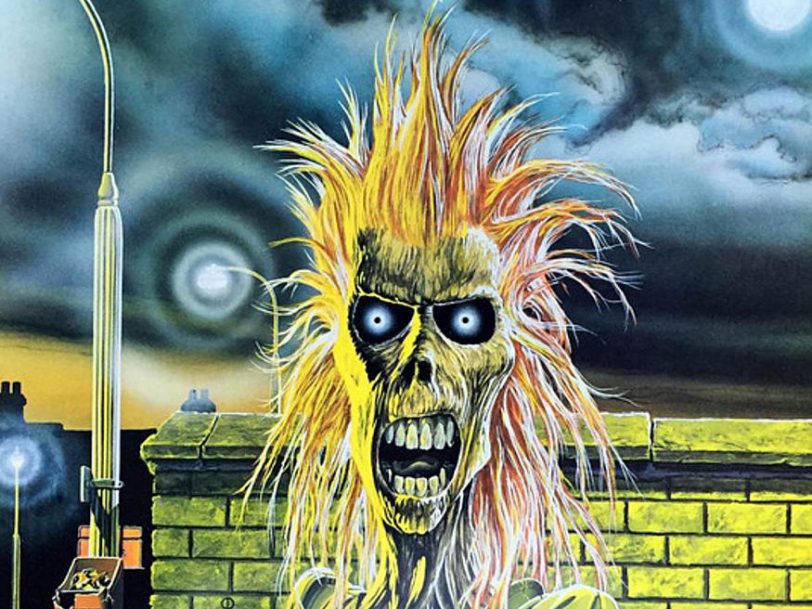
8: ‘Iron Maiden’ (1980)
Iron Maiden’s mascot, Eddie (also known as Edward T Head or Eddie The Head), had been known to appear onstage in a different guise during the band’s early concerts, but his gruesome visage first stared out at the world from the cover of Iron Maiden’s self-titled debut album. The image was inspired by a picture titled Electric Matthew Says Hello, by the then up-and-coming artist Derek Riggs, which led to Maiden’s manager, Rod Smallwood, commissioning Riggs to illustrate the band’s debut with a wonderfully nihilistic picture which remains among the best album covers of all time.
“I was working with symbolism at the time,” Riggs said in an interview with The House Of Wormwood. “I was trying to work out how to make symbolic imagery that people could read and that had some relevance in the culture of the time. So Eddie became the symbol for the wasted youth, the disenfranchised generation who couldn’t get a job and had no obvious future. I used a dead figure and dressed him in T-shirt and jeans and put him in London where I lived. He wasn’t some alien creature in some far off land, he was in your neighbourhood and in your face.”
Illustrator: Derek Riggs

7: ‘Brave New World’ (2000)
Iron Maiden’s 12th studio album, Brave New World, saw the group welcome both Bruce Dickinson and guitarist Adrian Smith back into the fold, and reclaim their place at metal’s top table. A barnstorming record which reintroduced Iron Maiden into the UK Top 10, it was also matched by a great sleeve, with Derek Riggs reinventing Eddie as an apocalyptic-looking cloud looming over Steve Stone’s futuristic CGI cityscape. The image was also recreated for the band’s stage show as they set off on a triumphant world tour to celebrate their reboot for the 2000s.
Illustrators: Derek Riggs, Steve Stone

6: ‘Fear Of The Dark’ (1992)
Derek Riggs’ seminal album covers effectively established the Iron Maiden brand during the 80s, but, for 1992’s Fear Of The Dark, the band looked for the first time to a different designer. Enter Melvyn Grant, famous for his illustrations for the Fighting Fantasy gamebooks, and whose first image of Eddie portrayed him as what Maiden biographer Mick Wall later referred to “as some sort of Nosferatu tree figure leering at the moon”.
“The original Eddie seemed to be very happy causing all sorts of chaos and hacking people to bits with axes and things like that,” Grant observed in an interview with Brave Words. “I did want to put more psychological tension into it. On Fear Of The Dark, I don’t think many people realise that Eddie is not actually sitting in the tree. He’s actually coming down from the tree… and it looks like Eddie has a tail close to the moon. I try to put a little more depth into it aside from utter brutality.”
Illustrator: Melvyn Grant

5: ‘Killers’ (1981)
Derek Riggs’ initial illustration for Iron Maiden’s debut album was startling, but he arguably bettered it with the cover for Killers, for which the group’s erstwhile mascot was transformed from a zombie street-punk to an axe-wielding maniac. Riggs’ use of both colour and shadow accentuated the brilliance of the picture, but the artist also strengthened the link between the band and their native East London by adding a few intriguing background details – not least the inclusion of the Ruskin Arms pub, where the band first cut their teeth on the live circuit.
Illustrator: Derek Riggs

4: ‘The Number Of The Beast’ (1982)
Iron Maiden’s The Number Of The Beast artwork had originally been prepared for the 7” edition of the group’s Purgatory single, but it’s hard to imagine the image gracing anything but Bruce Dickinson’s first album with the band. Another example of how the best Iron Maiden album covers have established themselves as truly iconic images within heavy metal history, The Number Of The Beast’s Judgement Day theme features Eddie as a gleeful puppet master controlling the Devil, who, in turn, controls his own mini-mascot while thousands of souls writhe in hell.
Illustrator: Derek Riggs

3: ‘Live After Death’ (1985)
Iron Maiden’s first official live album, Live After Death, still ranks among the greatest live albums of all time, and the group celebrated its release with one of their most lavish sleeves. Live After Death’s artwork suggests that Eddie has had more than enough of living as a god in the afterlife (see the No.1 entry in this list), and has decided to come back to life. Derek Riggs allows him to do so in spectacular fashion, too, depicting Eddie as he erupts from the grave in a thunderstorm, his hair all grown back. At this stage in the band’s career, Live After Death has done more than enough to sit in the upper echelons of the very best Iron Maiden album covers, but the massive booklet insert which came with the original release ensured that it was the band’s most generously packaged album of the 80s.
Illustrator: Derek Riggs

2: ‘Somewhere In Time’ (1986)
All of Derek Riggs’ Iron Maiden album covers can rightly be considered classics, but two of them are simply masterpieces. The first of these, Somewhere In Time – with its meticulously drawn Blade Runner-esque landscape, in which Eddie is depicted as a Terminator-like cyborg – features all manner of minute details across its full gatefold sleeve. Indeed, if fans study the illustration hard enough, they can even see images of Steve Harris’ beloved West Ham United football team thrashing Arsenal, and Bruce Dickinson clutching Eddie’s brain, from the Piece Of Mind artwork.
“Somewhere In Time is the most intricate album cover ever designed,” Derek Riggs declared in a 2012 interview with The House Of Wormwood. “There has been nothing that detailed before or since. In fact you can’t do that level of detail on a modern CD cover, it just won’t work very well. It acts as camouflage. Somewhere In Time only just about works on a CD cover. The only reason I got away with it in the first place is that it was done for [vinyl]. Twelve inches square is a lot more forgiving that a five-inch CD cover. Also it took three months to do all that work, nobody will pay you to do that anymore.”
Illustrator: Derek Riggs

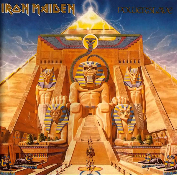
1: ‘Powerslave’ (1984)
Iron Maiden fans may have wondered what fate could befall Eddie after he was sectioned and lobotomised for the Piece Of Mind cover. The logical conclusion may have been that death couldn’t be far away – but fear not, for Derek Riggs had some elaborate plans for him in the afterlife. Indeed, the designer was helped along by the Egyptian theme of Powerslave’s title track, which inspired him to create his first masterpiece: a depiction of ancient Egyptians marching a sarcophagus into a pyramid fronted by a statue of Eddie, rendered as an Egyptian god. Another incredibly detailed illustration, it nominates itself for the top spot in our list of the best Iron Maiden album covers.
“[The band told me], ‘We’ve got this Egyptian thing and we want Eddie as part of a pyramid,’ or something, and Steve Harris had this 18th-century engraving of some guy dragging the head of Rameses,” Derek Riggs told Canada’s The Auburn Reporter. “So I sort of took the Egyptian idea and I started drawing. I did it on A3 layout paper… It’s like tracing paper, but it’s cheaper and it’s thinner so that you can draw a picture, and then you drop the next page over it, and trace the good bits and improve it… When I finished, it was about five foot square and it was all taped together.”
Illustrator: Derek Riggs
More Like This
Best Reissues Of 2024: 30 Of The Year’s Most Essential Releases
The best reissues of 2024 are bringing classic albums back to life in ways fans have never seen nor heard before.
Best British Bands: 15 Groups That Rocked The World
Though a product of their homeland, the best British bands have had a global impact that’s shaped the course of music history.
Be the first to know
Stay up-to-date with the latest music news, new releases, special offers and other discounts!


