
Towering above their contemporaries as the giants of graphic design in the music industry, there are few who have left an artistic footprint as huge as Storm Thorgerson and Aubrey “Po” Powell of English design group Hipgnosis. Founded in 1967, Hipgnosis revolutionised the concept of album artwork for the rock’n’roll era, with the best Hipgnosis album covers transforming the record sleeve from a merely utilitarian piece of packaging into an integral part of the listening experience itself.
The duo’s surreal, mind-bending designs for rock legends such as Pink Floyd, Led Zeppelin and Yes have gone on to become iconic works of art in their own right – eye-catching images that transcend their original purpose of providing the perfect visual complement to the boundary-pushing sounds blasting from listener’s speakers.
Here, then, is our list of the best Hipgnosis album covers: ingenious and enduring creations from the minds of Storm Thorgerson and Aubrey Powell.
Listen to our Rock Classics playlist here, and check out the best Hipgnosis album covers, below.
20: Led Zeppelin: ‘In Through The Out Door’ (1979)
Perhaps their most ambitious commission to date, the artwork for Led Zeppelin’s 1979 album, In Through The Out Door, saw Hipgnosis pull out all the stops. Truly ahead of its time, the idea was for the sepia-coloured artwork to have not one but six variants, each showing a different angle of a besuited drinker in a saloon bar, with the complete collection giving a full 360-degree view of the New Orleans nightspot.
Feeling this was a tad excessive, Led Zeppelin’s manager, Peter Grant, joked that the band were so popular that the album cover didn’t matter anyway – it would probably sell even if it came in a brown paper bag. So that’s exactly what Hipgnosis did, hiding each sleeve in a nondescript carrier. “The paper bag also meant you didn’t know which of the six covers you were getting,” guitarist Jimmy Page later said. “So you couldn’t choose which one to buy. I liked that, because it kept the mystery.”
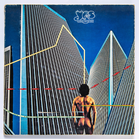
19: Yes: ‘Going For The One’ (1977)
Marking a radical departure from their previous work with illustrator Roger Dean, Yes commissioned Hipgnosis to design the artwork for their eighth studio album, Going For The One. Shot in California at the foot of the Century Plaza Towers, in Los Angeles, the cover depicts a naked man standing in a Da Vinci-like pose under a blue sky, admiring the futuristic-looking architecture in front of him.
With geometry-inspired force lines emanating from the man’s body, Going For The One is now regarded as one of the best Hipgnosis album covers, despite causing consternation in some quarters, for daring to show male nudity. “You have to put this in the context of a time when the gay movement was beginning to make its voice heard in a still fairly homophobic society,” Aubrey Powell later said. “Both Hipgnosis and Yes blasted [the homophobes] out of the water.”
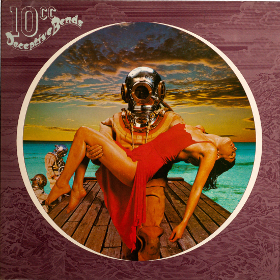
18: 10cc: ‘Deceptive Bends’ (1977)
Starting out as a tongue-in-cheek spin on a road-traffic sign, the cover for 10cc’s 1977 album, Deceptive Bends, found the Hipgnosis team playfully riffing on the idea of decompression sickness, depicting a heroic yet monstrous-looking diver emerging from the ocean’s depths holding a damsel-in-distress in his arms.
“The retro diving suits and helmets were a visual indulgence,” Aubrey Powell admitted, “great brass fittings gleaming, round helmet reminiscent of an astronaut and just something we liked the look of.” Inspired by the bizarre and metallic look of divers as depicted in 1930s films, Deceptive Bends stands out among the best Hipgnosis album covers for having all the kitschy power of a long-lost B-movie poster.
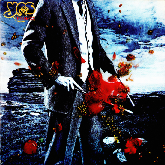
17: Yes: ‘Tormato’ (1978)
The strange title of Yes’ ninth album, Tormato, makes a lot more sense once you learn the story behind its unusual album artwork. Originally intended to be called Tor, the album received its new name after Hipgnosis photographer Rob Brimson presented the band with a piece of landscape art created after doing a photoshoot in the Peak District. Unfortunately for Brimson, the band hated it, prompting a frustrated Rick Wakeman to throw a tomato at the image.
Amused by this spontaneous act of vandalism, Hipgnosis adapted Brimson’s original shot by adding a faceless man holding divining rods, skewering a tomato in an explosion of pulp and seeds. This tickled the band so much they decided to rename the album Tormato, in commemoration of the incident. Funnier still, it later emerged the figure on the cover was actually Brimson himself. “I never knew it was me,” the photographer later admitted. “I presumed they’d hired a model!”
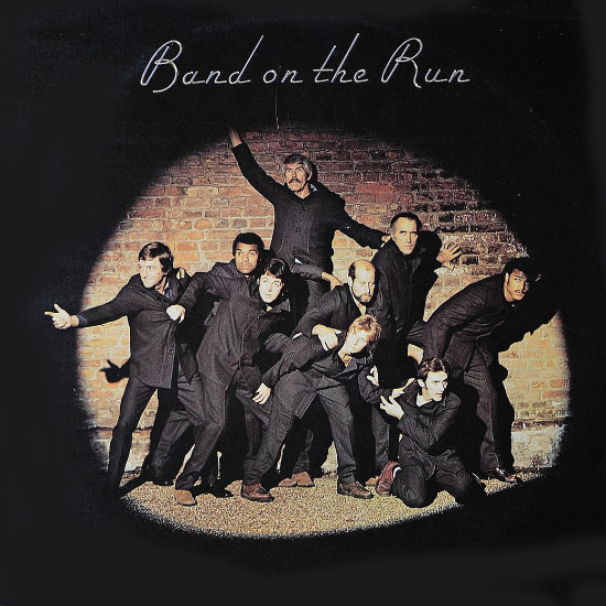
16: Paul McCartney And Wings: ‘Band On The Run’ (1973)
In Anton Corbijn’s brilliant 2022 documentary, Squaring The Circle: The Story Of Hipgnosis, Aubrey Powell describes getting contacted by Paul McCartney as being like receiving a phone call from God. Since McCartney already had a Band On The Run sleeve concept in his mind – spotlighting famous figures as if they were prison escapees – the commission didn’t exactly give Hipgnosis much creative wiggle room, but it was simply impossible to say no to the ex-Beatle.
“I agreed because of the groupie in me,” Storm Thorgerson said. “I fancied riding in Paul’s Roller and being in his kitchen, where it was rumoured there hung a real Magritte.” Despite being unable to crowbar their own eccentric ideas into it, the Band On The Run sleeve went on to become one of the best Hipgnosis album covers, instantly recognisable thanks to its use on one of the biggest-selling LPs of the 70s.
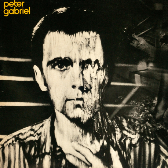
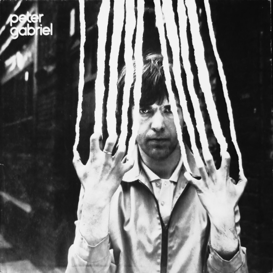
15: Peter Gabriel: ‘Peter Gabriel’ (aka “Melt”) (1980)
After messing around with the chemical alchemy of a Polaroid picture in order to morph Peter Gabriel’s face into a blurry mess, Hipgnosis took inspiration from a process pioneered by US photographer Les Krims to create their own “krismograph” for the singer’s 1980 album, which has gone on to be referred to as “Melt”, thanks to its iconic artwork.
“This cover is the perfect example of experiment and conviction,” Aubrey Powell later said. “A star turn deliberately allowed his face to be distorted and turned into a disturbing and grotesque image, just to be different.” Perfectly chiming with the post-punk era’s cynical attitude towards fame and self-image, “Melt” is one of the best Hipgnosis album covers to demonstrate the group’s edgy and iconoclastic spirit.
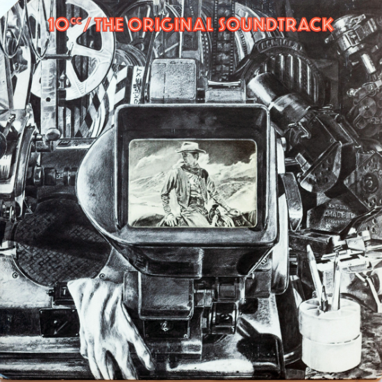
14: 10cc: ‘The Original Soundtrack’ (1975)
A set of dramatic art-rock songs intended to score a film that doesn’t exist, 10cc’s 1975 album, The Original Soundtrack, called for a sufficiently cinematic artwork from Hipgnosis. Tasked with conjuring the grit’n’glamour of Old Hollywood, talented illustrator Humphrey Ocean decided an incredibly detailed pencil drawing of a film editor’s assorted bric-a-brac was the best way of capturing the creative slog in all its chaotic glory.
“I approached it like a painter, not a graphic designer,” Ocean later said. “I have always preferred to draw things from life but I had to do this from a photograph.” The cowboy staring out from a Steenbeck machine cleverly hints at how movie magic is being summoned from the grubby paraphernalia of film spools, easily making The Original Soundtrack one of the best Hipgnosis album covers.
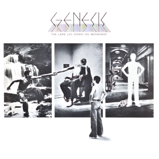
13: Genesis: ‘The Lamb Lies Down On Broadway’ (1974)
Telling the tale of a character called Rael who undergoes a journey of self-realisation, the narrative scope of Genesis’ 1974 double album, The Lamb Lies Down On Broadway, encouraged Hipgnosis to create artwork that resembled a graphic novel. Based on events outlined in the songs, the sleeve design features snapshots of Rael’s story, putting a meta twist on the front cover by showing him gazing back at his narrative progress.
“Where Rael had stepped from would leave a white space in his shape,” Aubrey Powell explained, “since the design is immersed in the conventions of comicland and the world of photography.” This postmodern subversion of a storyboard-style approach proved just how far outside of the box the best Hipgnosis album covers were, the design elevating an already-ambitious prog-rock epic from Genesis into a fully-fledged audio-visual experience.
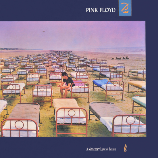
12: Pink Floyd: ‘A Momentary Lapse Of Reason’ (1987)
Adorning Pink Floyd’s 1987 album, A Momentary Lapse Of Reason, the surreal sight of an endless stream of hospital beds on Saunton Sands, in North Devon, easily earns a spot among the best Hipgnosis album covers. “A long line of beds stretching across the landscape as far as the eye could see,” was how Storm Thorgerson had pitched it.
“Real beds in a real place,” he continued. “So many that the viewer might ask how it was done as much as what it might mean.” Given that this ambitious cover was created in the days before Photoshop, it’s a remarkably striking and thought-provoking image whose status among the best Hipgnosis album covers assured when it won photographer Robert Dowling a gold award at the Association Of Photographers Awards.
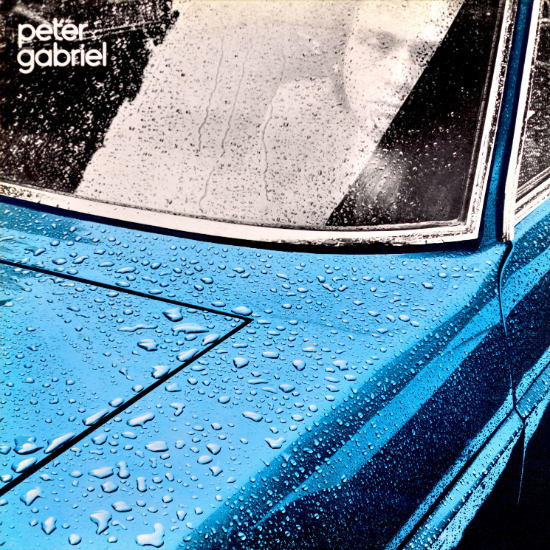
11: Peter Gabriel: ‘Peter Gabriel’ (aka “Car”) (1977)
A taxi ride on a rainy day is what inspired the cover for Peter Gabriel’s self-titled debut album (often nicknamed “Car”). Storm Thorgerson later explained the inspiration behind the design for Gabriel’s first solo venture after leaving Genesis: “On the bonnet of this vehicle sat myriad drops that were being shaken by the vibrating cab. I thought, That looks cool, can I duplicate it one day?”
To recreate the effect for his photo, Thorgerson sprayed his own freshly-waxed Lancia Flavia with a water hose. The resulting image, which saw Hipgnosis alter the car’s colour to appear fluorescent blue, exudes an urban-surrealist air of mystique, featuring Gabriel dozing behind the windshield as pearly droplets of water bead and accumulate like liquid metal.
10: Pink Floyd: ‘Atom Heart Mother’ (1970)
Featuring a cow called Lulubelle III staring back at the camera with a puzzled look on her face, the cover for Pink Floyd’s 1970 album, Atom Heart Mother, saw Hipgnosis revel in the art of bemusement. Setting out to create a “non-cover” that had no meaning whatsoever, Storm Thorgerson baffled listeners with his frivolity, only to see the image become iconic in its own right.
“There is no cosmic intent, no swirling landscapes of the mind, no graphic/logo type simplicity,” Thorgerson later explained. “No deep and meaningful statements. No psychedelia. Just a cow.” Far from seeing Hipgnosis be put out to pasture for their daft shenanigans, Atom Heart Mother immediately took its place among the best Pink Floyd album covers, fully establishing the design team as contemporary surrealists of the very first order.

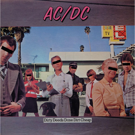
9: AC/DC: ‘Dirty Deeds Done Dirt Cheap’ (1976)
Memories are somewhat hazy as to how exactly Hipgnosis came to work with Australian hard-rock band AC/DC for the international release of their 1976 album, Dirty Deeds Done Dirt Cheap. “I can’t remember a darn thing about the assignment,” Storm Thorgerson admitted, “apart from a cast of licentious characters who might indulge in ‘dirty deeds’ and who, like offenders on television, require a black bar across their eyes to preserve anonymity.”
By toying with the idea of shady suburban miscreants and their hidden motives, the cover of Dirty Deeds Done Dirt Cheap succeeded in bringing the Hipgnosis team’s enigmatic and provocative style to a much wider audience. With the album going on to sell over six million copies in the US, it’s a real shame AC/DC didn’t work with Storm and Po again to create similarly gratifying works.
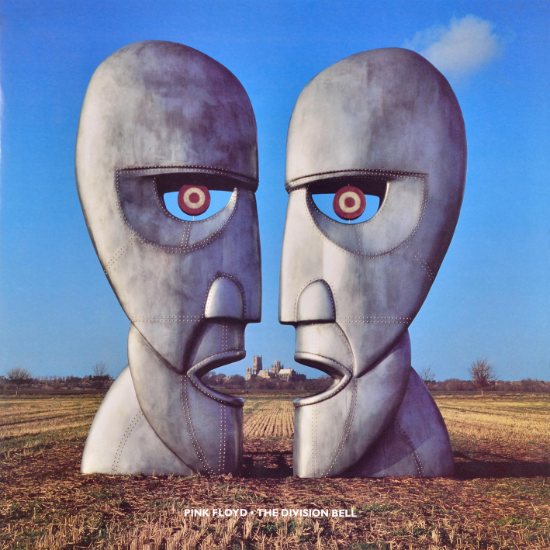
8: Pink Floyd: ‘The Division Bell’ (1994)
With much of the lyrics on Pink Floyd’s 1994 album, The Division Bell, exploring ideas related to the problems inherent in communication and the need for interaction, Hipgnosis created a cover that struck an intelligently haunting and ominous tone, thanks to two giant metal sculptures redolent of the Aku-Aku totems on Easter Island.
“They looked majestic, and spooky as hell,” Storm Thorgerson later said. “Two sets of heads, standing mute and imposing.” Describes by their creator as “eerie sentinels of the Floyd”, the statues depicted on The Division Bell prove how the best Hipgnosis album covers carried the team’s dark and cerebral vision of sleeve design into the 90s and beyond, the arresting image still retaining its power despite the passing of time.
7: Peter Gabriel: ‘Peter Gabriel’ (aka “Scratch”) (1978)
Taking an old Hipgnosis idea out of their box of “rejects”, Peter Gabriel fell in love with the concept behind the cover for his second self-titled solo album, commonly referred to as “Scratch”. Photographer Peter Christopherson was sent to New York City to take some twisted snaps, resulting in an image which Storm Thorgerson has described as Gabriel “thrusting his hands out and back onto the photo surface and scratching or tearing it into strips”.
With late-70s rock taking a turn to a more aggressive and abrasive style, Peter Gabriel’s “Scratch” sleeve has a sinister quality, the singer coming across like a horror-movie villain reaching out to deface the very album the listener holds in their hands. Again, it’s a very meta entry among the best Hipgnosis album covers, perfectly reflecting the team’s raison d’être.
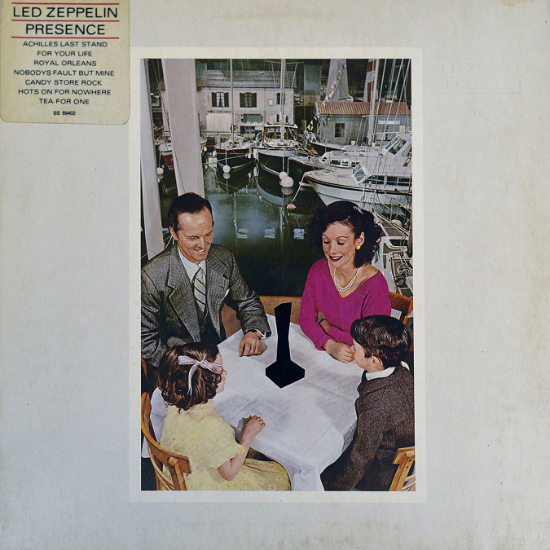
6: Led Zeppelin: ‘Presence’ (1976)
There’s a lot more going on than meets the eye on the cover to Led Zeppelin’s 1976 album, Presence. An average nuclear family are pictured gathered around a table at the Earls Court Boat Show, staring at a strange and mysterious black object, seemingly entranced, as if it is emanating some kind of mystical power. Building on this theme, other pictures Hipgnosis included inside the album’s packaging feature the same object in a range of different social settings.
“There are no shadows nor mouldings on the object, just flat black – hence it is a hole,” Storm Thorgerson later explained. “Not a presence (an object) but an absence (a hole).” As a clever comment not just on the arresting quality of Led Zeppelin’s music, but also on the seductive power of consumerism itself, Presence ranks among the best Hipgnosis album covers for the way it expresses how people project meaning onto objects that otherwise mean nothing at all.
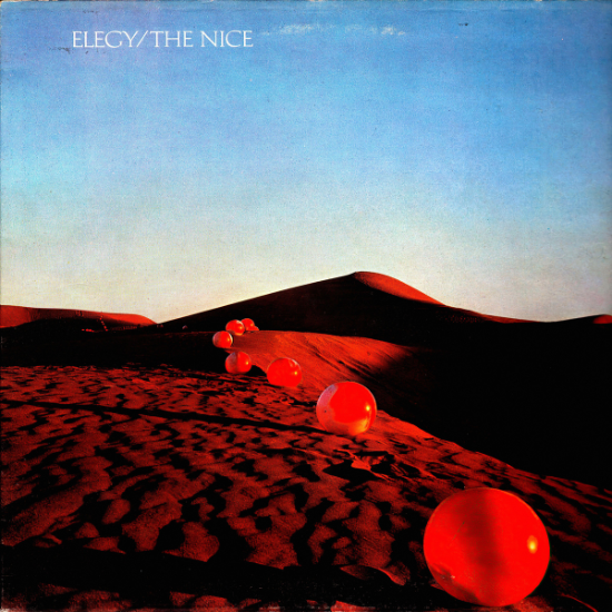
5: The Nice: ‘Elegy’ (1971)
Waking up from a dream after listening to an advance copy of The Nice’s 1971 album, Elegy, Storm Thorgerson had a bizarre vision of a row of red footballs flowing across the sand dunes of a desert. The band’s singer, Keith Emerson, loved the idea, so Storm and Po pitched it to the record company, somehow persuading the label bosses to fly them out to the Sahara desert so they could do a spot of landscape photography.
With the hot Egyptian sun beating down upon them, the duo had to inflate around 60 red footballs, being careful to brush away any footprints using a broom; their efforts resulted in an astonishing work of art that is confounding as it is beguiling. “I think Elegy is a seminal cover for us; it proved we could do it, we could turn an idea on paper into a reality,” Thorgerson later reflected. “Extreme ideas were possible in rock’n’roll, if only you have the balls.”
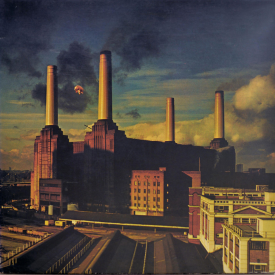
4: Pink Floyd: ‘Animals’ (1977)
Based upon an idea to fly an inflatable pig above London’s Battersea Power Station, the artwork for Pink Floyd’s 1977 album, Animals, reaches lofty heights on our list of the best Hipgnosis album covers. Insipiring one of the greatest sleeve designs to emerge from the classic-rock era, the concept of “pigs might fly” became real when the helium-filled inflatable pig broke free from its restraints during a photo shoot and flew into the flight paths of Heathrow Airport, causing a tabloid frenzy.
“Everybody thought we’d let it go on purpose, as a publicity stunt, and I sometimes think we should have,” Storm Thorgerson later said. “Either way, it was the best publicity the Floyd could have had for any new album.” With the photos later being superimposed to show the power station sitting ominously under soot-black clouds, the pink pig flying in the sky captures the idiom’s expression of incredulity and disbelief. By perfectly complementing the Orwellian political critique of Pink Floyd’s music, Animals is a truly timeless work among the best Hipgnosis album covers.
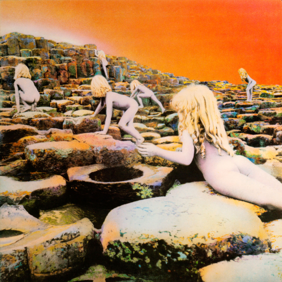
3: Led Zeppelin: ‘Houses Of The Holy’ (1973)
Shot in Giant’s Causeway, Northern Ireland, the cover for Led Zeppelin’s 1973 album, Houses Of The Holy, was inspired by the ending of Arthur C Clarke’s 1953 sci-fi novel, Childhood’s End, in which a group of alien children leave planet Earth. Aiming to capture what their home-world would look like, the Hipgnosis team painted seven-year-old Samantha Gates and her little brother, Stefan, in silver and gold, and sent the siblings clambering over the volcanic rocks. Unfortunately, the rainy weather conspired against photographer Aubrey Powell, forcing him to shoot in black-and-white and abandon his idea of featuring the whole family together.
“I realised that we could collage the cover together, due to the octagonal shaped rocks, if I photographed the children separately yet carefully composed,” Powell said. Later, the various shots were slotted together like puzzle pieces, and Philip Crennel hand-tinted the colours, turning the sky an eerie hue of orange. Taking the best Led Zeppelin album covers up a conceptual notch, the design for Houses Of The Holy was a spectacular success story that marked the start of a very fruitful partnership between Hipgnosis and the group.
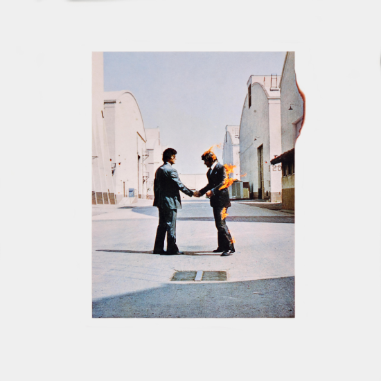
2: Pink Floyd: ‘Wish You Were Here’ (1975)
For an album whose lyrics address the darker aspects of fame and the pitfalls of the music industry, Hipgnosis created a design that perfectly represented the sealing of a Faustian pact. Based upon the idea of being “burned” or “betrayed” by a crooked deal, the cover for Pink Floyd’s 1975 album, Wish You Were Here, depicted two businessmen shaking hands, with one of the figures being on fire.
Undertaking the dangerous photo shoot on the Warner Bros studio lot, it fell to stuntman Ronnie Rondell to wear an asbestos suit and be set ablaze. “The first attempts at setting him alight were in the wrong wind direction,” Storm Thorgerson remembered. “The flames were blown back and ignited his moustache for an instant. A close shave, one might say.” Created in the face of danger, the sleeve for Wish You Were Here presents a jaw-dropping visual metaphor that remains a classic among the best Hipgnosis album covers.
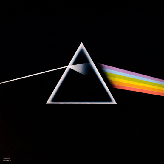
1: Pink Floyd: ‘The Dark Side Of The Moon’ (1973)
With Pink Floyd asking for a clean and simple graphic similar to the design of a box of Black Magic chocolates, Hipgnosis truly outdid themselves when they created the cover for 1973’s The Dark Side Of The Moon. Featuring a triangle with a beam of light refracting into a rainbow prism, the image mirrors the fracturing of the self – a theme explored throughout the record’s lyrics, which are centred around madness and human struggle. Going on to sell over 45 million copies worldwide, the album’s enduring appeal is inextricably tied to the success of its sleeve, which is frequently ranked among the best 70s album covers.
“It was a big success,” Aubrey Powell reflected. “I had no idea that 50 years later that it would still be this singular image that would be as popular, if not more than ever.” To this day, The Dark Side Of The Moon’s design remains a timeless symbol that continues to reverberate throughout popular culture, featuring on everything from T-shirts to coffee mugs – and that’s why it tops our list of the best Hipgnosis album covers.