Enter your email below to be the first to hear about new releases, upcoming events, and more from Dig!

Please enter a valid email address
Please accept the terms
Designing ‘The Dark Side Of The Moon’: Behind Pink Floyd’s Iconic Album Cover
In Depth

Designing ‘The Dark Side Of The Moon’: Behind Pink Floyd’s Iconic Album Cover

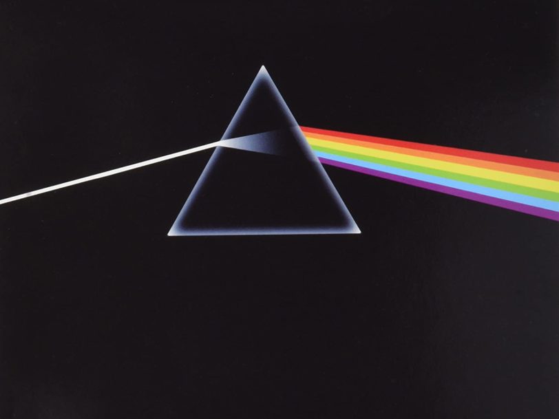
With its prism logo conveying an air of mystery, Pink Floyd’s ‘The Dark Side Of The Moon’ album cover remains a work of cosmic wonder.

Back

Lauded as a masterpiece ever since its release, in March 1973, Pink Floyd’s eighth album, The Dark Side Of The Moon, is easily one of the most influential records in rock roll history. Not only are its unique soundscapes and deeply philosophical lyrics truly timeless, but its immediately recognisable album cover has since passed into pop-culture folklore and been immortalised on T-shirts, posters and other merchandise around the world

Created by British design studio Hipgnosis, it’s easy to see why The Dark Side Of The Moon is considered by many to be one of the best album covers of all time. Here is the story of how Hipgnosis created the iconic rainbow prism logo and birthed an enduring symbol that’s become forever synonymous with the majesty of Pink Floyd.

Listen to the best of Pink Floyd here.

The inspiration: “The idea itself was cunningly cobbled from a standard physics textbook”

Having already created some of the early Pink Floyd album covers, it was no surprise when graphic designers Storm Thorgerson and Aubrey Powell were approached to devise the artwork for The Dark Side Of The Moon. Working from a brief that asked for something clean and elegant, Thorgerson and Powell looked to their bookshelf for inspiration. “The idea itself was cunningly cobbled from a standard physics textbook,” Thorgerson recalled in 2003, in a press interview marking the album’s 30th anniversary.

As they flicked through the textbook’s pages, something striking jumped out at them. “In this book was a photo of a prism on a piece of sheet music and sunlight coming in through the glass window,” Powell explained, according to Jean-Michel Guesdon and Philippe Margotin, authors of Pink Floyd: All The Song. “It was creating this rainbow effect.” Knowing how important light shows were at Pink Floyd’s live concerts, it seemed like a fortuitous discovery, so the designers began to think about how they could adapt the image into something that reflected The Dark Side Of The Moon’s lyrical themes of madness and existentialism.

The design: “No amount of cajoling would get them to consider any other contender”

With artist George Hardie drawing the illustration, the team at Hipgnosis set a triangle against a plain black background, with a beam of light shining through it. “Its outline is triangular and triangles are symbols of ambition, and are redolent of pyramids, both cosmic and mad in equal measure, all these ideas touching on themes in the lyrics,” Thorgerson said in 2003. With a ray of light refracting through the triangular prism and dispersing into six spectral rainbow colours, it seemed the design was always destined to be the perfect visual accompaniment to The Dark Side Of The Moon.

After spending weeks preparing several draft proposals, Storm Thorgerson and Aubrey Powell presented their ideas to Pink Floyd at EMI Recording Studios in Abbey Road, London. Remarkably, the band gave their unanimous answer within five minutes. “No amount of cajoling would get them to consider any other contender,” Thorgerson revealed, “nor endure further explanation of the prism, or how exactly it might look.” So strikingly appropriate was the prism in all its simplicity and minimalism, it was instantly apparent that the artwork had ingeniously captured the essence of the album Pink Floyd were preparing.

“When The Dark Side Of The Moon was mentioned,” Powell explained in John Harris’ The Dark Side Of The Moon: The Making Of The Pink Floyd Masterpiece, “it was always clearly in the context of the back of the mind; something to do with the unknown. Because at the time, the dark side of the moon was unknown. It was always considered to be a metaphor for the other side of madness.” The visual depiction of light refracting into rainbow colours can be seen as a metaphor for the fracturing of one’s self – how a single life experience can splinter into many hues and colour our perception of reality.

Safe in the knowledge that the concept was approved, the Hipgnosis team worked on finalising the idea at their London studio, with the spectrum design eventually running throughout the record’s gatefold sleeve, like a heartbeat on an oscilloscope, before connecting with a prism on the rear. “The design is simply a mechanical tint lay, which means we drew outline shapes, black on white, and indicated what colours were to appear when printed,” Thorgerson explained of the artwork’s creation process. Speaking to Hypergallery after creating a limited-edition silkscreen print of the cover, he continued, “The prisms were airbrushed black on white and reversed by the printer.” Unlike most of Hipgnosis’ previous projects, this was a purely graphical undertaking, with no photography involved, making it a pioneering endeavour for the designers and marking a turning point in the history of album cover creation.

The legacy: “Immediately our design was everywhere and that changed our fortunes”

When The Dark Side Of The Moon was released, on 1 March 1973, its eye-catching artwork was unveiled in record shops all over the world. Not only offering listeners a revolution in sound, but also proving to be a boon in brand recognition for Pink Floyd, the rainbow prism icon quickly became a unique work of art in its own right. Storm Thorgerson even recognised the potential of recreating the album’s artwork in a shop window and having the spectrum travel around the store itself – though this idea never came to fruition.

Regardless, the phenomenal sales which greeted The Dark Side Of The Moon meant the rainbow prism become a unique selling point. Going on to adorn T-shirts, posters, mugs and countless other items of band-related merchandise throughout the decades, it is now one of the most beloved and enduring symbols in the history of classic rock, doing for Pink Floyd what the three-pointed star has done for Mercedes. One of the best 70s album covers, it arguably defines the album almost as potently as the music itself.

The album’s success also helped raise the profile of Hipgnosis exponentially, leading the design studio to receive commissions for Genesis and Led Zeppelin album covers. “When we peaked with Dark Side Of The Moon in 1973, it sold 55 million copies,” Aubrey Powell said in an interview with Noisey. “Immediately our design was everywhere and that changed our fortunes. We were very much in demand.” One of the greatest album covers of all time, Hipgnosis’ artwork for Pink Floyd’s The Dark Side Of The Moon remains their finest and most era-defining achievement.

Buy Pink Floyd vinyl, box sets and merch at the Dig! store.

More Like This

‘Heroes Are Hard To Find’: In Search Of The Real Fleetwood Mac
In Depth

‘Heroes Are Hard To Find’: In Search Of The Real Fleetwood Mac

With their manager launching a fake version of the band, Fleetwood Mac returned victorious with the ‘Heroes Are Hard To Find’ album.

‘Charli’: The Full Story Behind Charli XCX’s Delayed Third Album
In Depth

‘Charli’: The Full Story Behind Charli XCX’s Delayed Third Album

Delayed after initial recordings were leaked, Charli XCX’s third album, ‘Charli’, found its creator taking more chances than ever.

Sign up to our newsletter

Be the first to hear about new releases, upcoming events, and more from Dig!

Sign Up